Your home office can be many things. A sanctuary of concentration and productivity, a makeshift desk space in a previously unused room or perhaps a shared space for multiple members of your household to work, learn and complete tasks in peace.
Whatever the circumstances, you need a space that works best for you - a space that suits your interior design goals and serves your needs. An important but often overlooked first step in transforming your home office into such a space is the colour. So, what’s the best colour for a home office?
New Neutrals
Colour has a proven effect on mood, our ability to concentrate and how we can effectively complete certain tasks. A neutral colour scheme may seem like an obvious place to start when planning the design of an inviting, relaxing home office that's easy on the eye.
The joy of neutral colours is they’re easily paired together, combining to create a level of depth that feels natural and makes a more subtle statement. Our top picks for warm neutral shades include Joa’s White, Dead Salmon and Elephant’s Breath by Farrow & Ball.
Farrow & Ball are known for their paints being eco-friendly and washable, meaning they can turn any wall into a whiteboard or writing surface. It's the perfect choice if you value sustainability. For those wanting to opt for a more cost-effective brand, Dulux has a range of complimentary warm neutral shades such as Almost Oyster, Egyptian Cotton, Malt Chocolate and Muddy Puddle that help create the perfect home office environment.
Feeling Blue
Research indicates the colour blue lowers heart rate and blood pressure and slows respiration. Because of this, it’s known to induce feelings of calmness, leading to enhanced decision-making ability and efficiency.
If your home office needs to serve as a soothing and productive space, light blues, such as Benjamin Moore’s St John Blue, are an obvious and airy choice for good reason. For a richer, more sophisticated look, a matte or mid-sheen deep blue, such as the shades Cerulean, Oxford or Indigo from luxury eco-paint brand Graphenstone, are ideal.
To add an extra pop of colour in your home office, look for a comfortable office chair that complements the shade of blue, along with a reliable, sturdy desk made from the finest materials to complete your work.
Paint The Town Red
The effects of red on the human body and mind are the polar opposite of the colour blue’s influence. Red acts to increase heart rate and pulse, creating a feeling of being energised and awake. That's why we suggest using red in your home office if you’re more of a night owl, you utilise your evenings to get ahead of tomorrow’s work or to collaborate with colleagues and clients operating in a different time zone.
Red is a powerful colour and can easily overtake a smaller home office - especially one that doesn't have much natural light. Make red the centre of attention and push your desk against a red feature wall.
Little Greene has several fantastic shades of red wall paint, including Atomic Red, Bronze Red and Drummond, as well as a red wallpaper with a classic, 70’s french-feel design called Lavaliers Atomic. You'll also notice in the image below how certain areas of the desk, as well as the stool, perfectly match the colour of the red wallpaper.
Go Green
Everyday life can be stressful, so why not reduce stress in your home office space? Green is a proven calming colour and is more easily perceived, reducing eye strain potential. Not only this, but the human eye can also detect more shades of green than any other colour, which makes choosing what shade of green to paint your home office an important decision.
Benjamin Moore’s Pale Oak is a neutral, green-toned off-white which gives the clean look of white at first glance and calming undertones of green. For bolder options, Farrow & Ball’s deeper Studio Green and Duck Green are excellent options, with Cooking Apple and Calke Green acting as lighter and more vibrant choices.
Green walls aren't the only way to bring the calmness of nature into your home office either. The positive impact of houseplants on people’s physical and mental wellbeing is well documented, so be sure to find space in your home office for some succulents or potted plants too, regardless of what colour you choose to base your home office design around.
Shades Of White
White is a crisp, clean, contemporary colour choice for any room of the house. It provides a blank slate for decor and for the mind and lends to an appearance of bigger and brighter rooms. That's why white, in all it’s subtly different and numerous shades is the ideal colour for multipurpose home office spaces.
If your home office space is shared between more than one member of your household for multiple purposes, a white or off-white shade could be your best option.
Pointing by Farrow & Ball, and Cloud White by Benjamin Moore are classic examples of strong off-white colour options, or you can choose to paint your office an existing shade of white already present in your home to marry the shared spaces.
Tonal Touches
Certain colours - such as yellow, purple or black - all have their own impacts on the human brain that can be beneficial in a working environment but can be too overpowering for painting your entire home office. In these instances, we suggest using these hues in low saturated shades as accent colours to a home office that's either white or leans into a complementary colour.
Make use of the colour wheel to pair your chosen accent colours well and be sure to research the colours you’re considering using. Yellow, for example, is said to be good for boosting mood and creativity but can over-stimulate the eyes, causing distraction or strain.
Easy ways to add touches of colour are by:
- Choosing furniture, accessories or soft furnishings in your chosen accent palette.
- Using fresh flowers or plant pots in your preferred colour to create a small, health-boosting indoor jungle.
- Refinishing or upcycling furniture to include your colour of choice. For example, you could paint the top of your oak or solid wood desk in your accent colour.
Your home office is probably an area you're spending a lot of time in right now, whether it's for work or a getaway to escape from the outside world. Although, you may also be thinking about the potential of other rooms in your home.
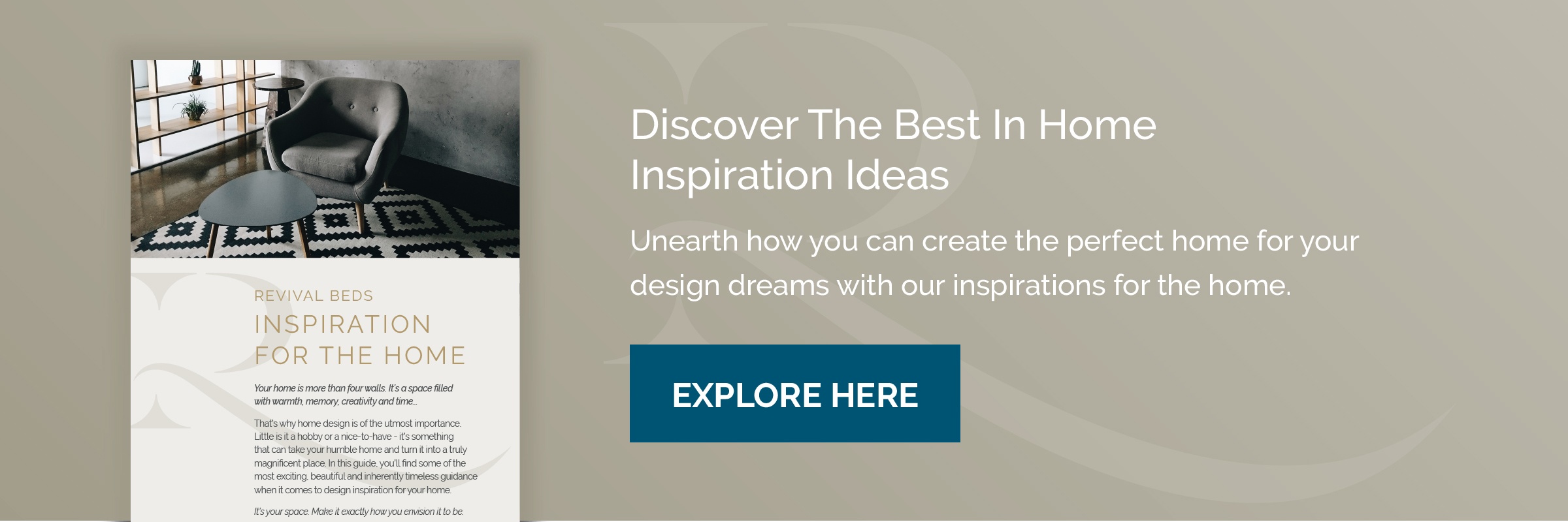
Save time spent flipping through stacks of design magazines and searching through online design boards with our free downloadable design inspiration guide, here to help you fall back in love with every corner of your home.
Creating Your Perfect Home with our inspirations guide
Whether your dining room needs redecorating or you want to spruce up your bedroom space, finding home inspiration that suits your style doesn't need to be difficult. Our free guide is on hand to provide inspiration that will help you create a beautiful and modern home that reflects who you are and is welcoming to your friends and family.
Click below to explore the endless possibilities presented in our free guide.
.jpeg?width=352&name=County-Cork-Firestone-Leather-Main%20(2).jpeg)
.png?quality=low&width=352&name=pasted%20image%200%20(3).png)