.jpeg?width=596&name=County-Cork-Firestone-Leather-Main%20(2).jpeg)
When we think about oak furniture, ideas of timelessness, durability and beauty are conjured. It’s a material brimming in heritage. By choosing the finest handcrafted oak furniture, you’ve already started to sow the seeds of a colour scheme — even if you haven’t considered specific shades to pair with your furniture yet.
Oak lends itself to certain hues over others. Because of the unique grain and gradient of each piece of furniture, you’ll need in-depth considerations for your colour scheme. We’ve compiled a list of colours that go with oak furniture, as well as expert tips around tailoring colour schemes to different rooms of your home and different gradients of oak.
- Why Does Colour Matter What Colours Go With Oak Furniture?
- Ocean Blues
- Softer Neutrals
- Subtle Greens
- Ravishing Reds
- How To Match Your Oak Furniture
- Are There Any Colours To Avoid?
Why Does It Matter What Colours Go With Oak Furniture?
Oak epitomises luxury. It’s also a versatile material, fitting seamlessly into many differently-styled homes, from something more traditional like a country house to something uber-contemporary such as a modern apartment. It’s always a popular choice.
How you tie your furniture into your colour scheme or build your colour scheme around your furniture is the foundation of creating a truly wondrous space. Regardless of whether the furniture is new or has been owned by you for a while, the room's colour palette should always complement it. Without a complementary palette, furniture can feel out of place.
Trying to create your own version of domestic bliss? We thought so. For more inspiration when you’re finished up here, read our guide to creating the perfect home. Don’t worry; you can click the link now and it’ll open in a new window, so your reading experience isn’t interrupted.
Ocean Blues
Blues pair well with the creamy oak tones, balancing out warmth with something a little calmer and cooler in nature.
Think of Farrow & Ball’s Inchyra Blue or Dulux’s Sapphire Salute as inspiration. Using either of these shades on your walls acts as a classic backdrop for framing oak. But blue can also be injected into rooms with oak furniture in various ways, from pops of colour using small items like decorative plant pots to grounding the space with a larger statement like a rug or artwork.
All in all, blues invoke calm and, depending on the light, can appear grey or even green — there’s a shade of blue to suit everyone.
All in all, blues invoke calm and, depending on the light, can appear grey or even green — there’s a shade of blue to suit everyone.
Best For: Open Plan
Open plan homes benefit from blues as they help unite the space while creating more than one mood with subtle shade changes in different areas. Dreamier shades in lounge areas can complement darker blues in dining spaces.
Top tip: Hint to the alternating shade in accessories of the opposite area. Put lighter blue tones into accessories where darker blue hues dominate and vice versa.
Softer Neutrals
Choosing colours with similar undertones to your oak furniture creates a softer neutral look, but one with equal drama and impact as bolder blues or greens.
Beiges, taupes and rich browns help the furniture blend in with the colour scheme, allowing for a smooth visual narrative. The result? Your room will look larger and, often, more inviting.
.jpg?width=602&name=County-Cork-Firestone-Leather-Main%20(2).jpg)
The County Cork in all its glory, sporting firestone leather and a rich brown bedspread.
Softer neutral tones can also help your oak furniture stand out. As you can see in the image above, the rustic wall and pared-back bedroom accessories give full attention to the craftsmanship of the bed.
While the colour theme is surprisingly simple, there’s still a subtle contrast between the walls, the oak furniture and the flooring.
Best For: Bedrooms
As neutrals and rich tones create that cosy feeling, they work well in bedrooms where comfort is the main aim. However, neutral tones are suitable for any space and do wonders for small, cramped areas of the home that need opening up.
Top tip: Pair softer neutral tones with moody lighting. Consider dimmer switches, warm bulbs and darker shades to create the right ambience.
Subtle Greens
Like the leaves on their original trees, oak pairs beautifully with organic green shades. You can contrast a dark oak grain with lighter green or mirror the deeper colour with more of a forest green.
For example, Dulux has a range of green options in their offering, such as the almost dark teal Emerald Glade or the Scotland-inspired Highland Green.
According to a study by Dulux, green is the best colour for achieving a peaceful night’s sleep, as it helps us relax and even ease stress. So for your bedroom, pair a deep green hue with a beautiful hardwood oak bed to sleep soundly.
Best For: Kitchens and Bathrooms
Despite its sleep benefits, we think organic greens work best in kitchens, bathrooms and anywhere hygiene is chief. The natural feel of green and oak together makes for a fresh, clean feel.
Top tip: Create a statement with green but don’t allow it to overpower the area. Use green to frame an alcove or tile your backsplash and always pair it with paler tones.
Ravishing Reds
Red isn’t a colour most people associate with oak — and we see why. Red can feel too harsh, bold and daring for many budding designers.
It can also border on being old-fashioned, meaning you need to be careful when crafting a red-toned colour palette. Go all in and you can risk creating a stiff, boardroom-like feel that isn’t appropriate for most modern homes.
.webp?width=602&name=Ambassador-Solid-Oak-Four-Poster-Bed.jpg%20(1).webp)
The Ambassador Four Poster proves natural oak can pull off romantic reds, creating intensity and intrigue.
But bear in mind, like every other colour, there are a variety of hues and options when it comes to red. From romantic, rich shades to cherry and pink-tinged hues, you can be as audacious or as cautious as you like.
Best For: Offices and Guest Rooms
Red can feasibly work in any room, but since it can urge you to feel more alert, it tends to work best in areas of focus such as offices or even guest rooms that pack a punch. If you want to leave a lasting impression, don’t discount red.
Top tip: Steer away from block red walls, which can too easily transport interiors to another time. Instead, play with red as part of a pattern or in smaller sections of the room.
How to Match Your Oak Furniture
Oak is a unique product. Every piece is different due to its grain — though most natural oak is creamy and characteristically yellow-toned.
Some may find it hard to discover the perfect complementary colour scheme, especially if oak has been wax finished. However, these key practices make it easier:
- - Identify the undertones: Is your oak characteristically yellow-toned or does it have red pigmentation? Some varnishes can emphasise pigmentation, making the colour of oak appear stronger.
- - Consider any other materials: Does your oak furniture sport brass handles? Does it have chrome hinges? These details can change whether your colour scheme is cool or warm-toned.
- - Don’t forget your personal preference: Take notice of the unwritten interior rules, but remember to have fun when decorating your space. After all, it’s you that’s there to enjoy it.
Are There Any Colours to Avoid?
In truth, there aren’t many colours that don’t match well with oak. While oak pairs the best with natural tones; deeper blues, greens, reds and also neutrals, brighter colours aren’t off the map.
Cherries, lime greens and autumnal oranges do well to highlight the natural lustre of oak. A good rule of thumb is to view darker shades as creating either mood, drama or cosiness and lighter or more saturated colours as providing energy and zest.
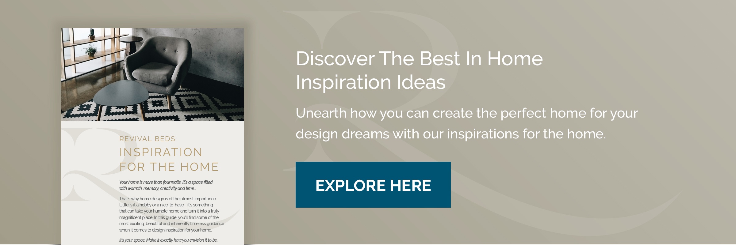
Find More Inspiration to Create the Perfect Home
Enjoyed this blog? We’ve written a guide to help you stumble across new ideas and luxury inspiration for redesigning your home. Whether you’re looking into the durability of oak and what themes to pair it with or you're trying to create the perfect contemporary home, this is the inspiration guide for you.
Click the link below to begin your download.